
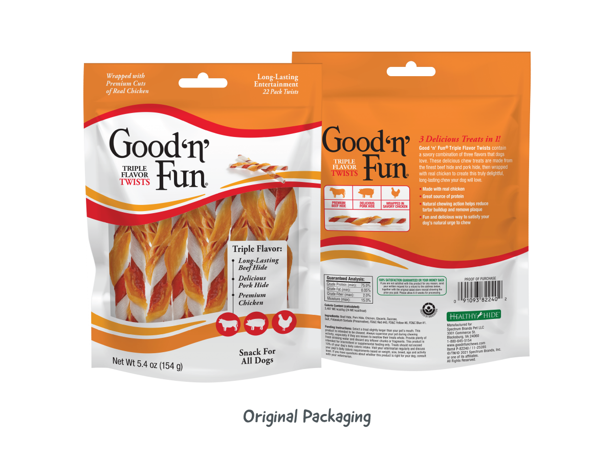
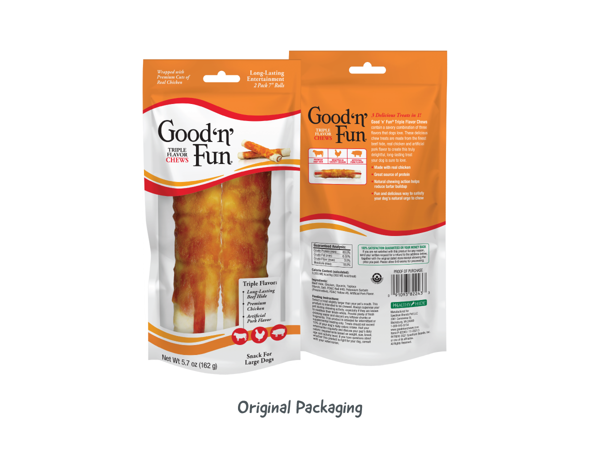
Good'n'Fun® dog chews combine long-lasting entertainment with real proteins and playful shapes that dogs love. While maintaining brand recognition, evolving category standards and modern competitors highlighted the need for a more focused, fun-forward visual identity.
The 2025 facelift refined the brand system and laid the groundwork for a 2026 refresh to improve shelf visibility, clarify claims, and reinforce the playful personality.
Production Artist / Graphic Designer
Brand Refresh & Packaging Strategy
2025 Refresh + Future Refresh Concepts
Modernize and focus packaging to reinforce playfulness, improve shelf performance, and clarify benefits—without losing equity or familiarity.
Highlight the brand’s dual promise: playful engagement and real protein credibility. Typography, logo, color, imagery, and hierarchy were optimized to reinforce personality, prioritize claims, and improve retail performance.
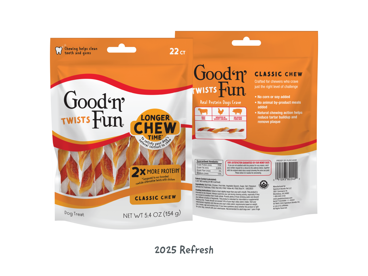
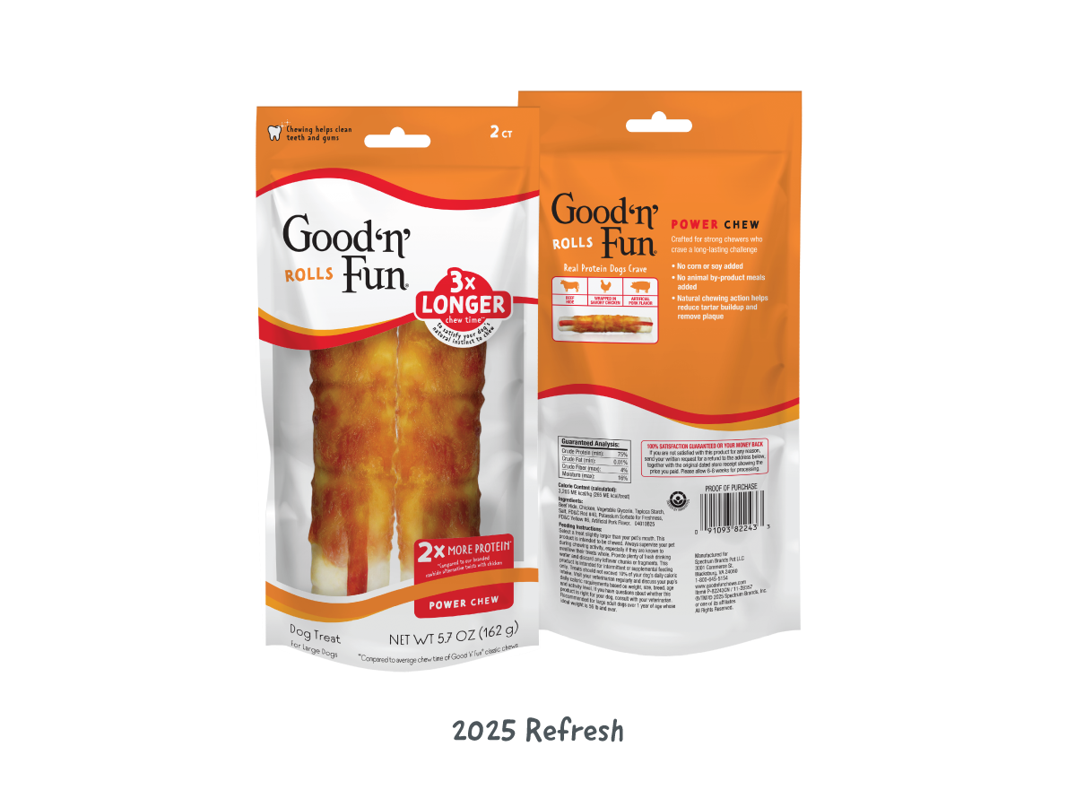
The 2025 refresh organized the brand into "Classic" and "Power" tiers, highlighting chew longevity as the primary claim. Simplifying the product name created space to prioritize key benefits, while a large clear window ensured strong product visibility—balancing functional communication with playful brand expression.
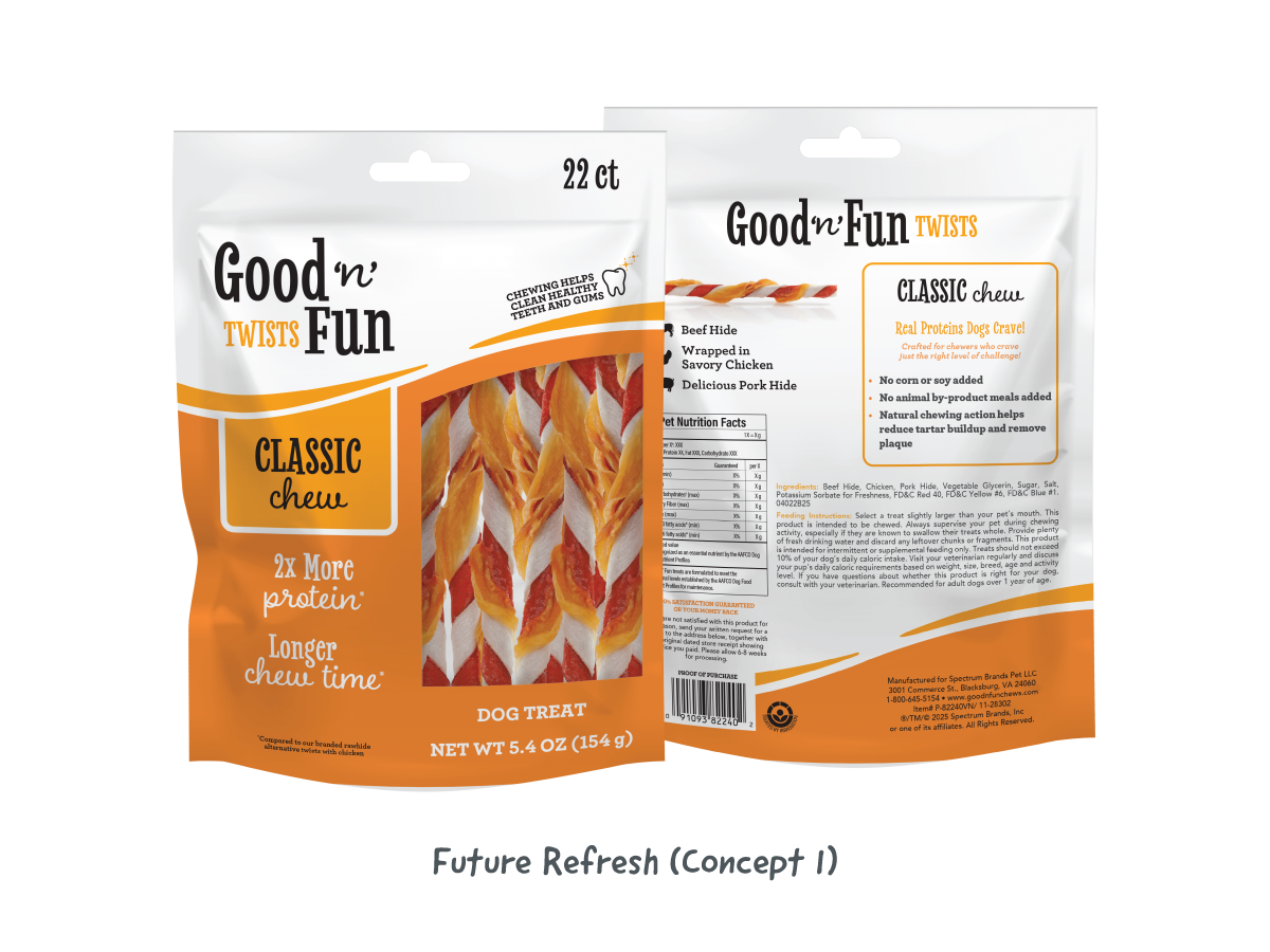
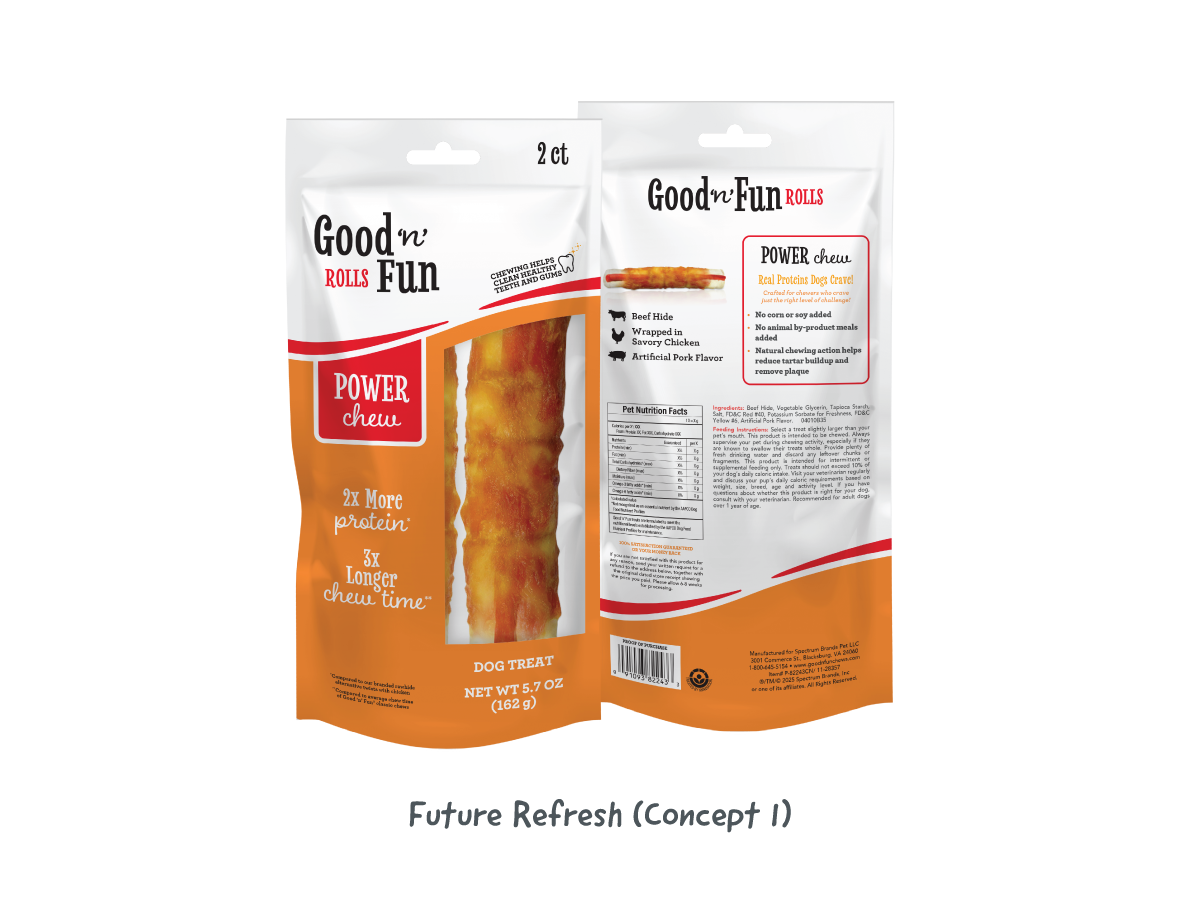
Concept 1 preserved core brand equity while updating typography across the logo and packaging to amplify the playful spirit introduced in the 2025 refresh. Halving the clear window strategically reclaimed space for key claims, improving information hierarchy and ensuring functional messaging remained prominent on shelf.
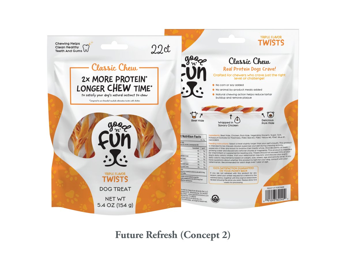
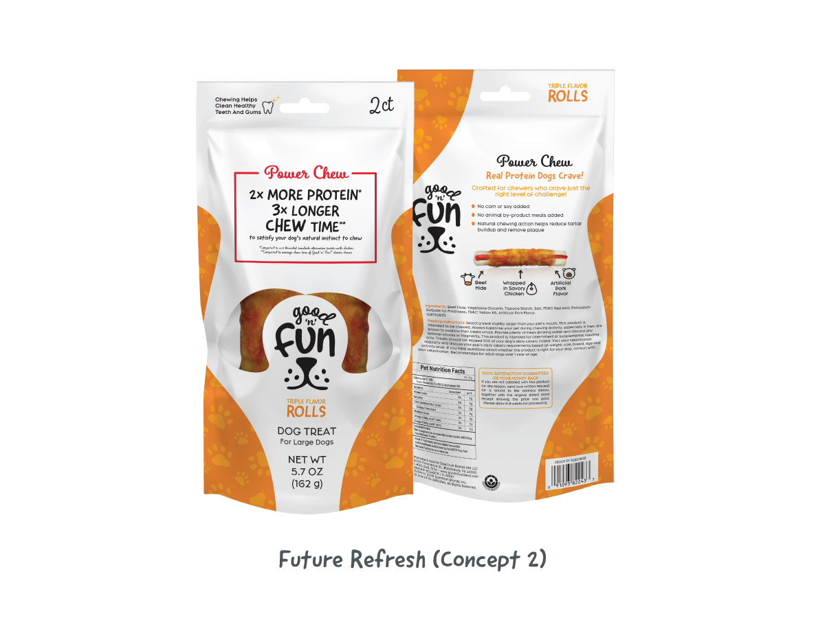
Concept 2 pushed the brand toward a more expressive, fun-forward direction. A rounded, handwritten logo introduced greater playfulness, while a reduced clear window allowed space to integrate a dog-face silhouette directly into the packaging. Updated typography and iconography reinforced the playful tone and strengthened visual differentiation in a competitive aisle.
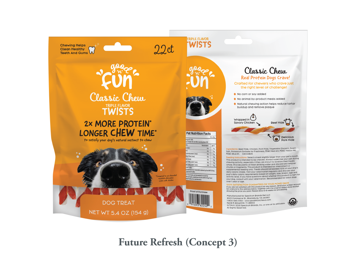
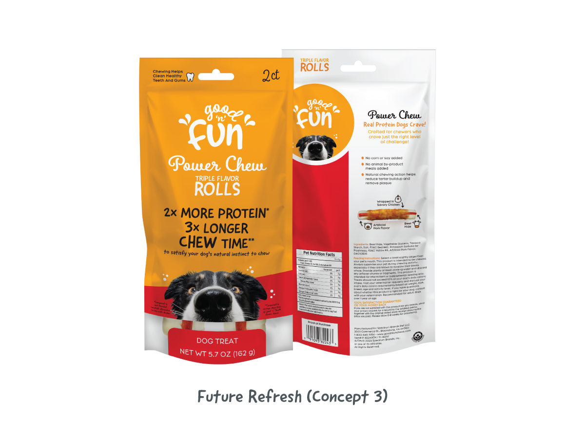
Building on Concept 2, Concept 3 incorporated dog photography to create a more emotionally engaging experience for consumers. The imagery was positioned to draw the pet parent’s eye and convey the joy and interaction the chew provides, linking product function to emotional appeal.
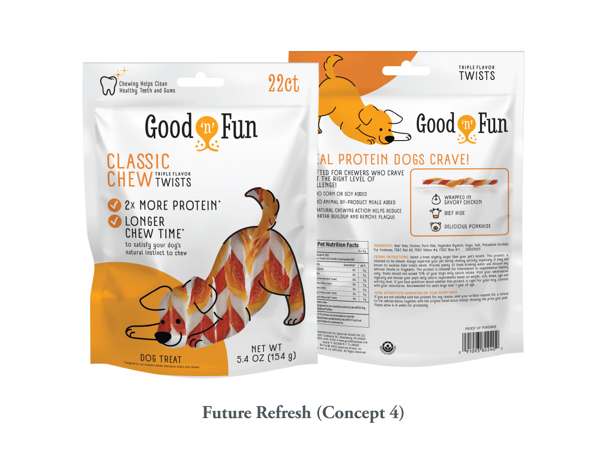
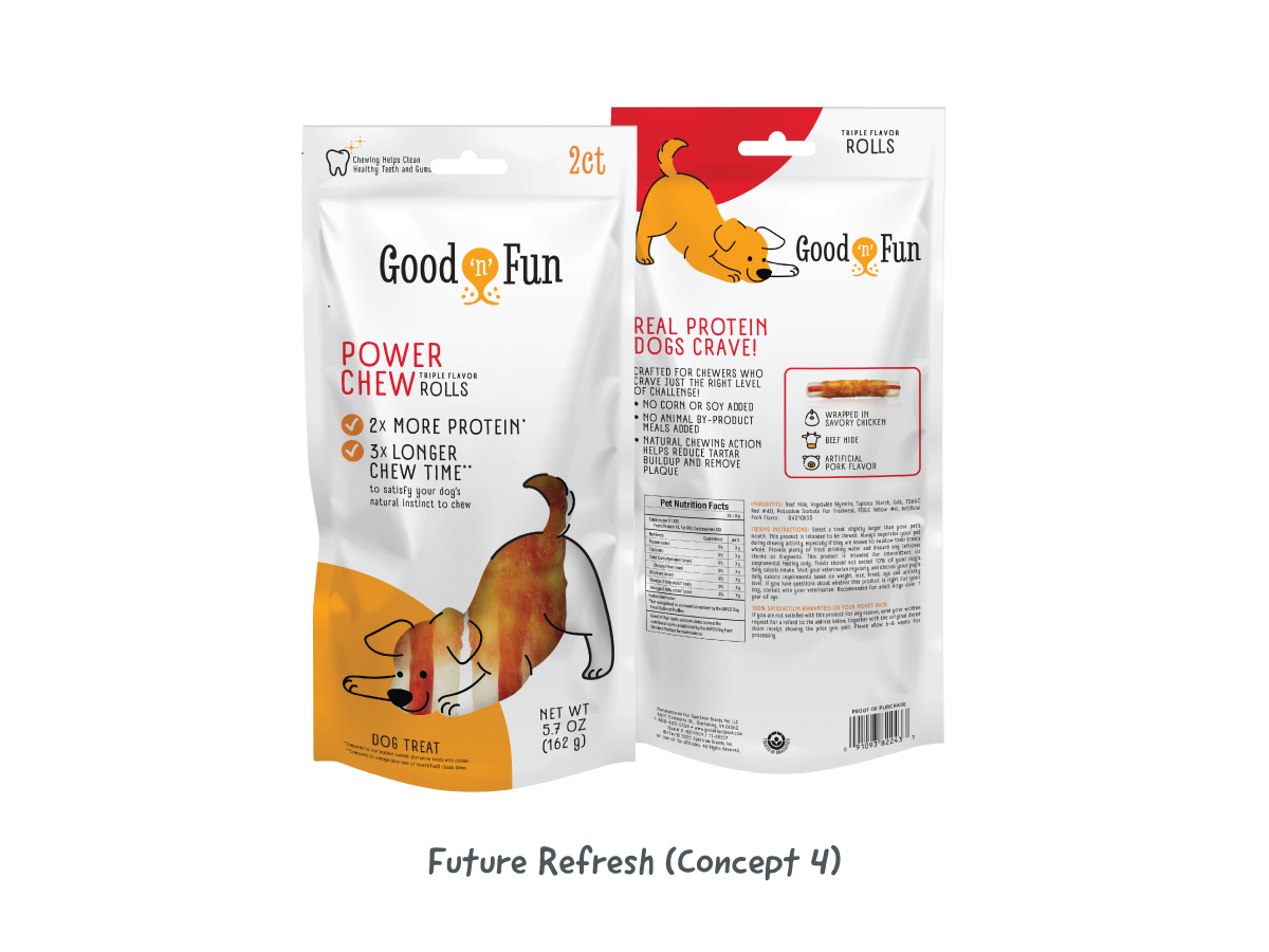
Concept 4 explored a balanced approach between playfulness and sophistication. A rounded, playful logo was paired with a more conservative serif to appeal across audiences. The dog’s body served as the clear window, maintaining strong product visibility while supporting a clear hierarchy for key claims. Typography and iconography were updated to reinforce the playful tone without compromising readability.
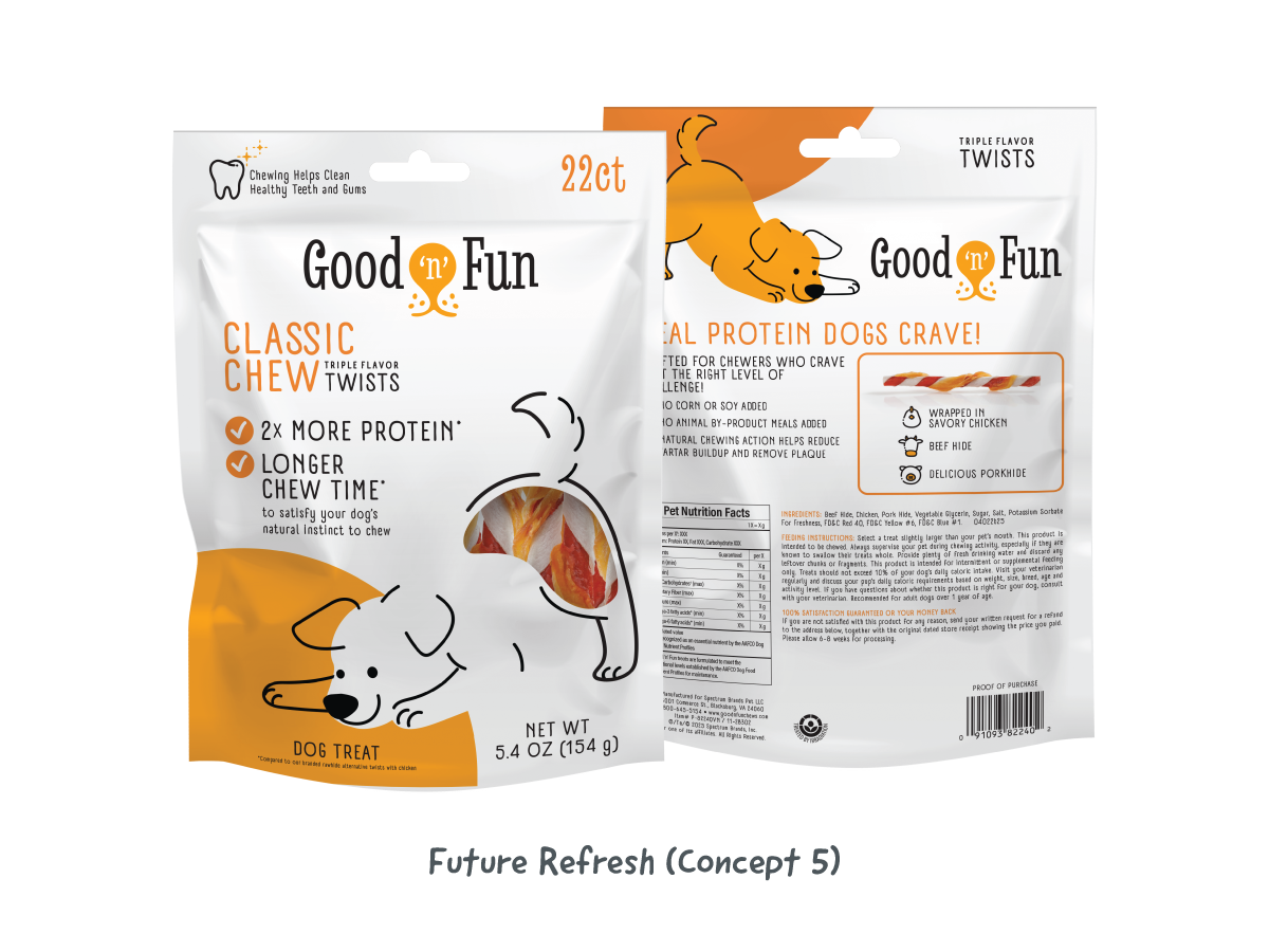
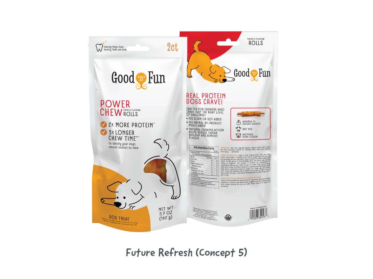
Concept 5 refined Concept 4 by reducing the clear window, creating a clear visual separation between the dog imagery and the product for stronger messaging.
Original Good 'n Fun'® and 2025 Refresh packaging designs are the intellectual property of Spectrum Brands, Inc. Future Refresh concepts remain the intellectual property of Rachael Hollis unless and until such concepts are formally presented to and produced by Spectrum Brands, Inc. All work is displayed for portfolio purposes only.