
The Crooked Tree Coffee House is a family-owned café celebrated for exceptional coffee and a welcoming space. While the in-store experience was strong, the digital presence did not reflect the café’s warmth or quality.
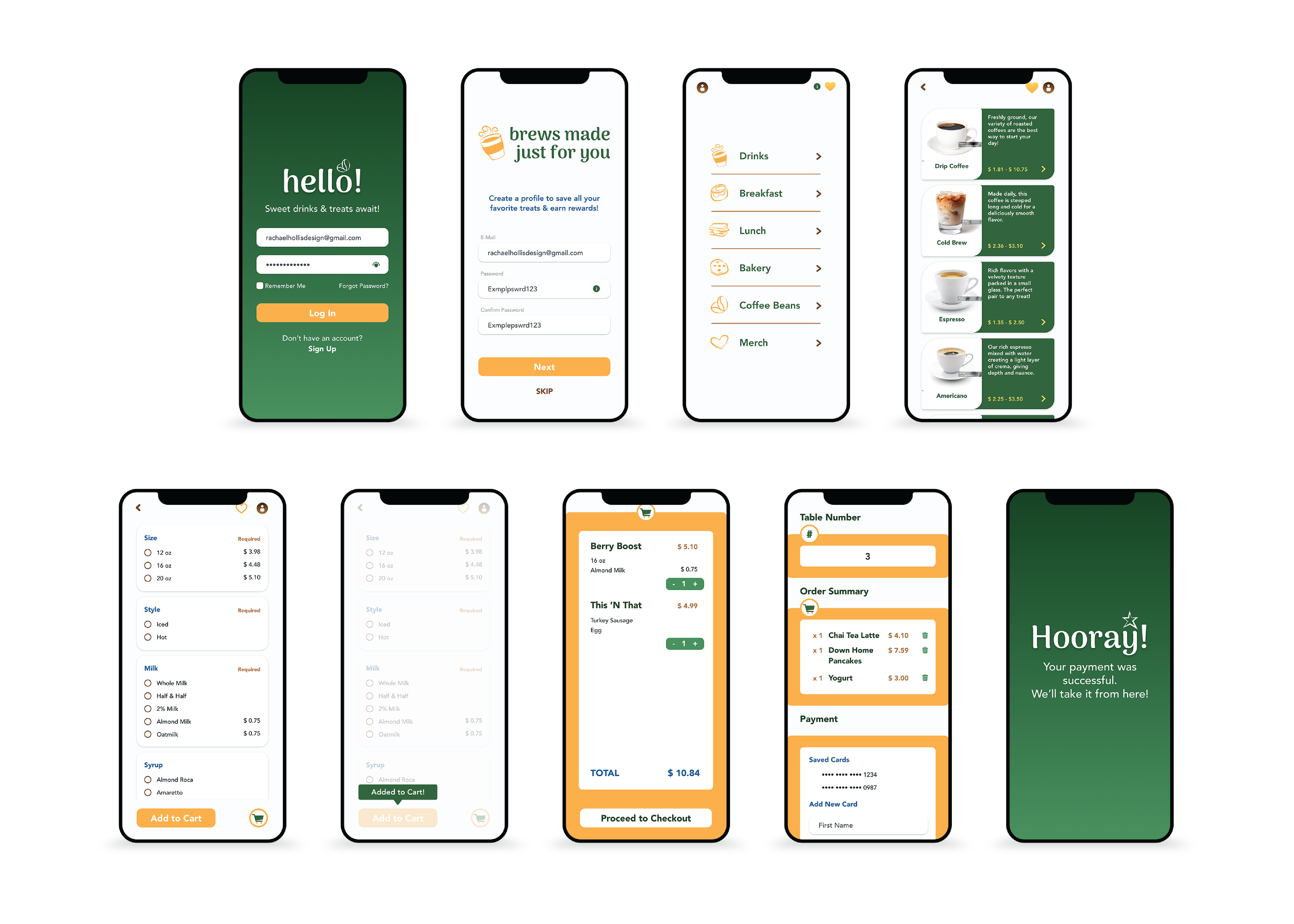
A website refresh and mobile app prototype were developed to create a seamless, intuitive digital experience that mirrored the in-person brand while supporting convenience, social engagement, and repeat use.
UI/UX Designer
Mobile App Development & Online Presence Update
Create an intuitive user experience for a variety of consumers.
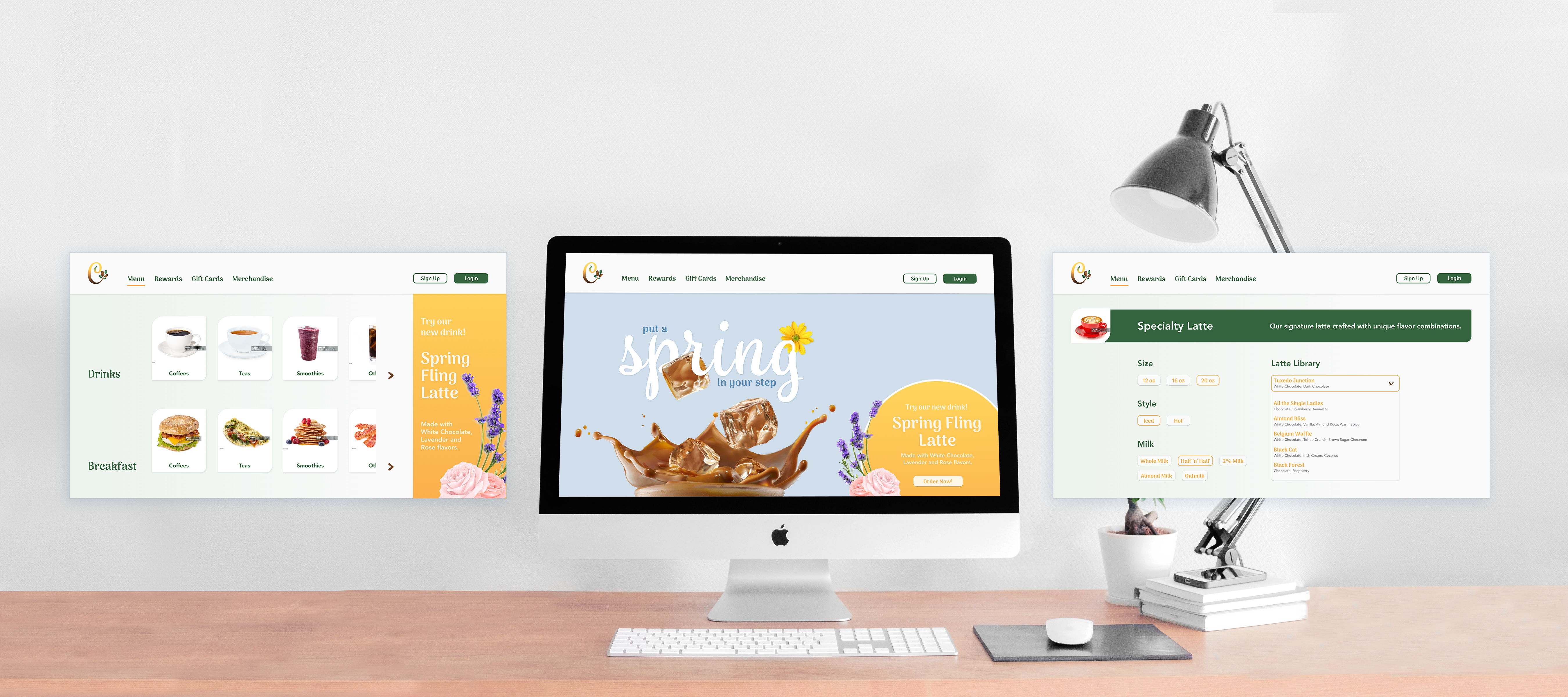
Modernize the digital experience to reflect the café’s personality while making ordering and navigation intuitive for guests, first-time users, and returning customers.
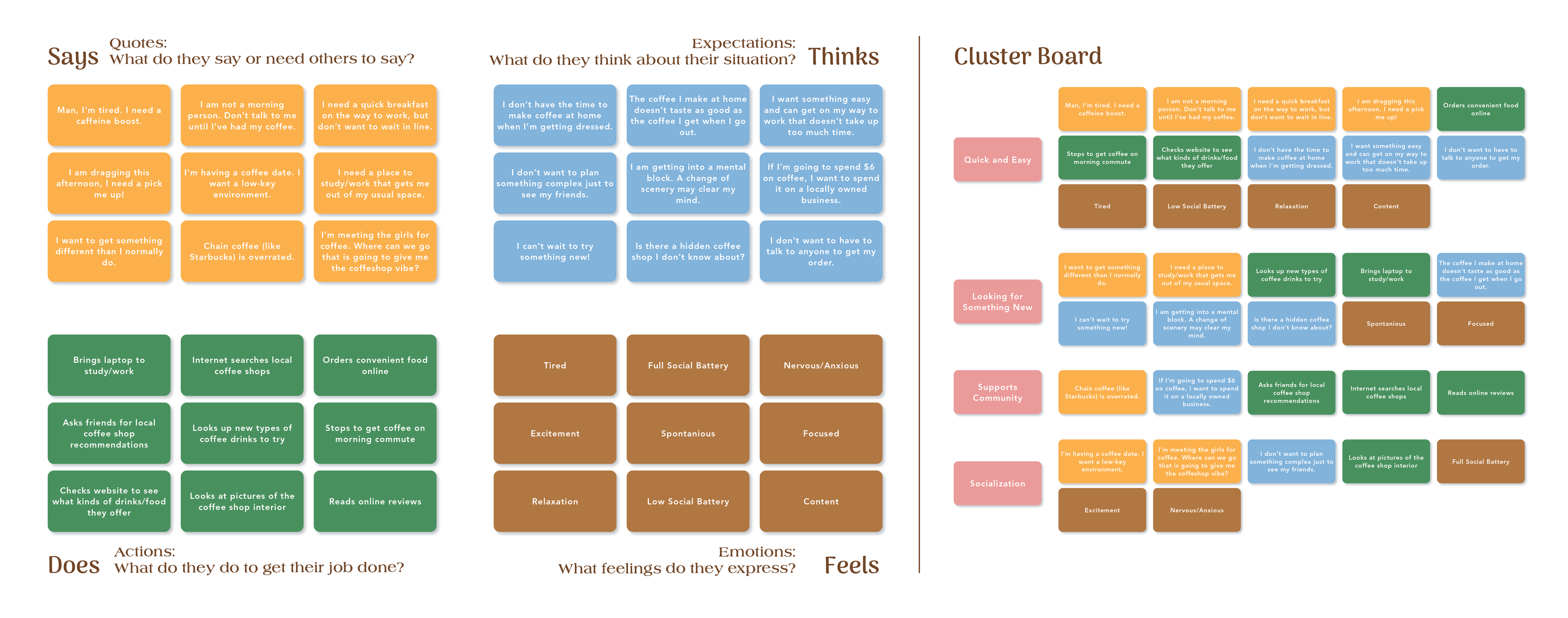
Translate the warmth and care of the café into a digital interface. Research of competitor apps informed hierarchy, layout, and visual design. User flows were designed to meet the needs of diverse users while keeping interactions fast and intuitive.
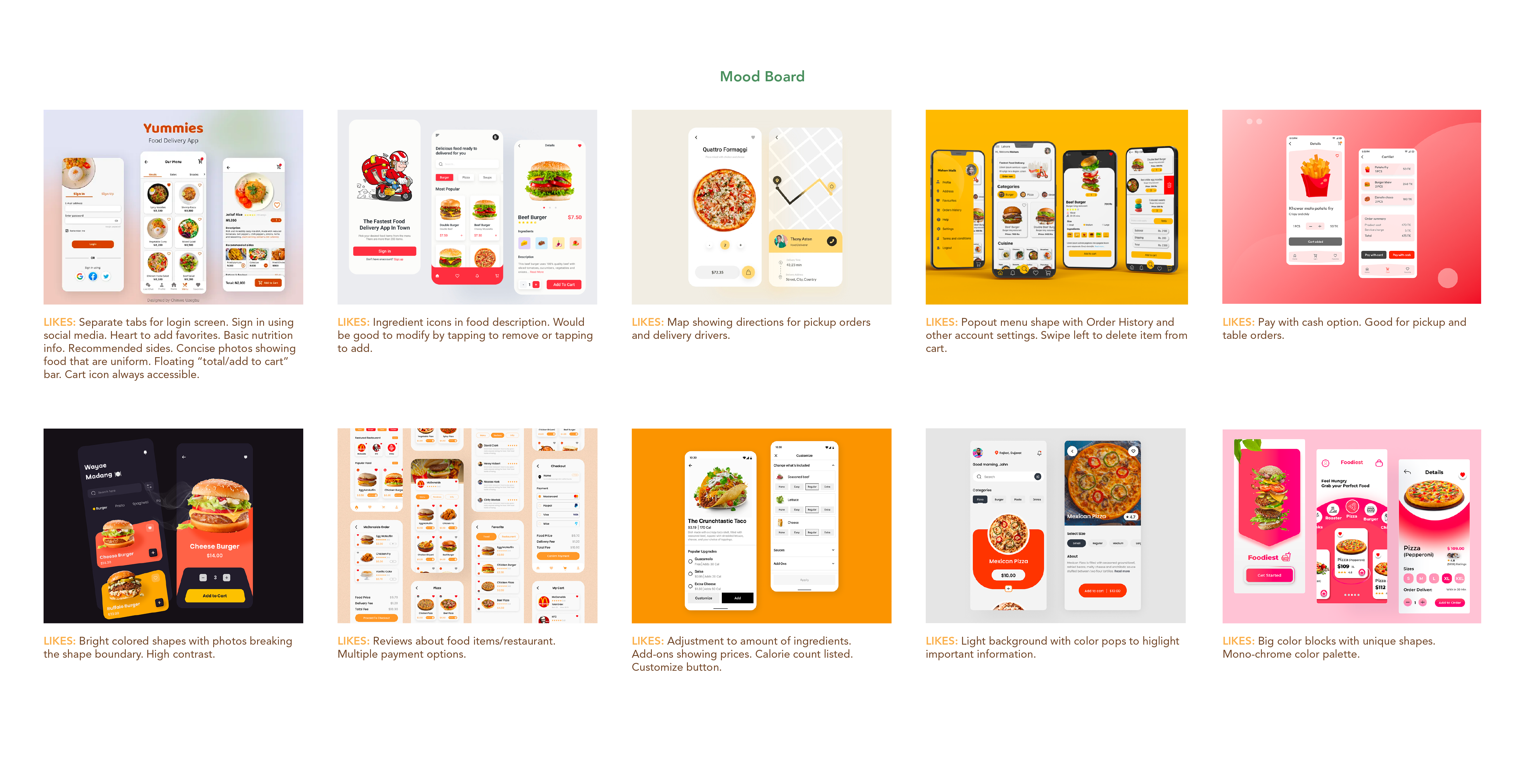
Key design considerations included:
Consumers are seeking a quick, seamless way to order their morning coffee or afternoon pick-me-up. Whether they are stopping in on their way to work or meeting friends to catch up, they’re looking for an experience that feels a little more special—something beyond the routine of a drive-through chain. The goal was to highlight the café’s ability to deliver both convenience and a sense of community, offering thoughtful service and a welcoming atmosphere that encourages guests to slow down and enjoy the moment.
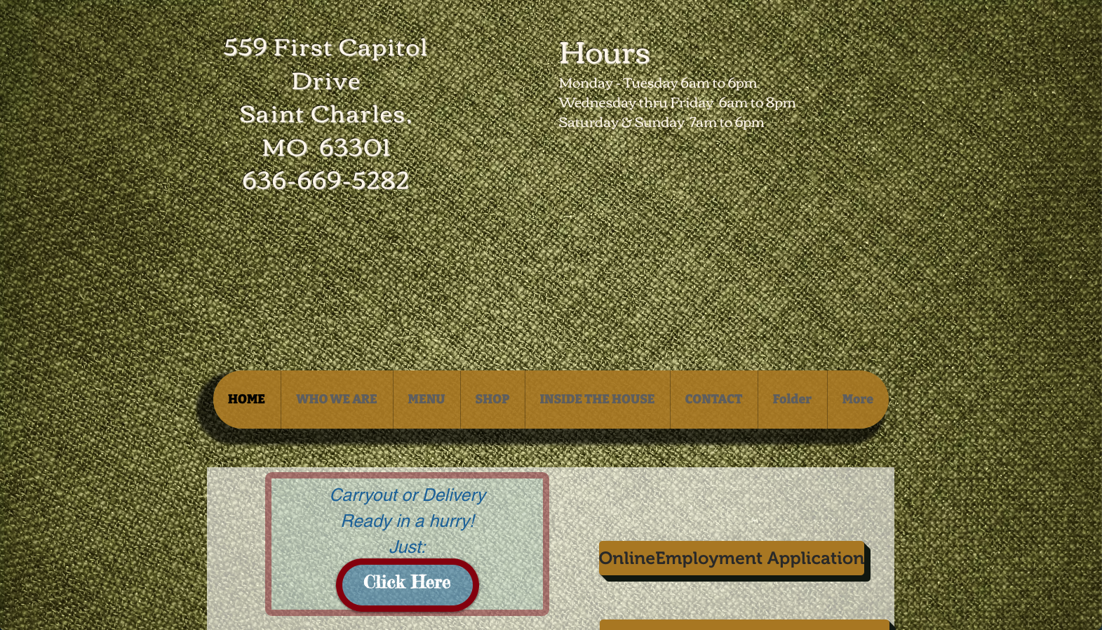
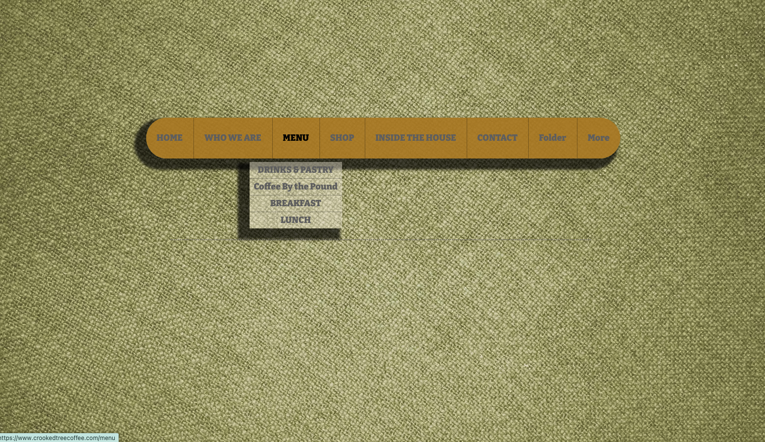
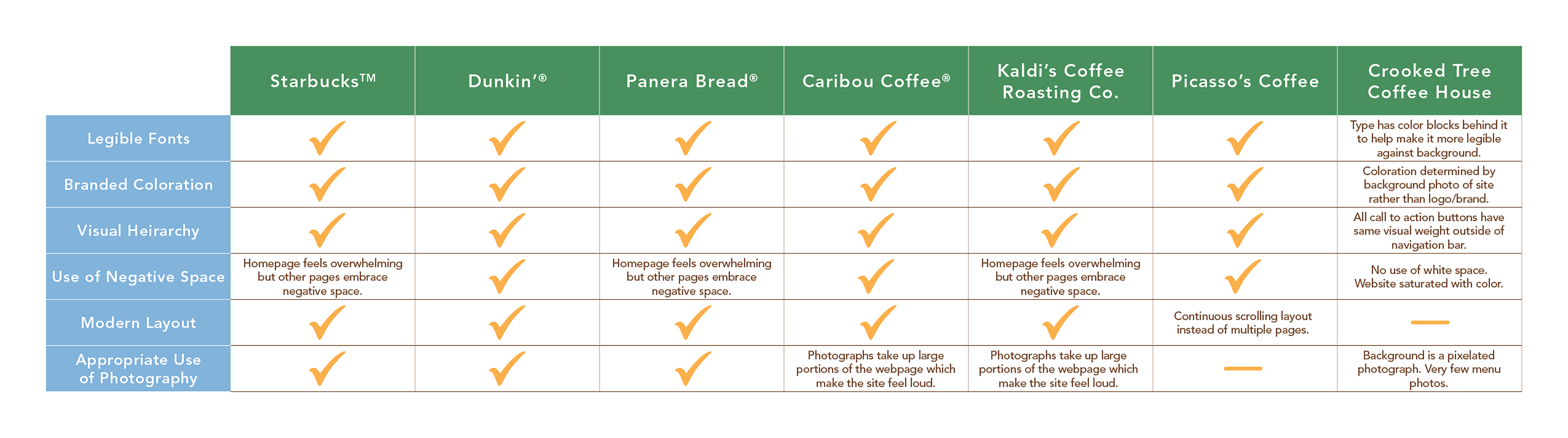
Competitor websites and mobile apps prioritize strong legibility, consistent branding, and a clear visual hierarchy that guides users smoothly through the experience. These platforms often rely on generous negative space and modern layout structures to keep content easy to scan and navigate. In contrast, the existing site was visually crowded, with an overabundance of imagery and low contrast between elements, making it difficult for users to quickly find key information or complete common actions like browsing the menu or placing an order.
Compared to competitors, The Crooked Tree Coffee House offered a broader range of features accessible to all customers. While many large retailers reserve key functionality—such as mobile ordering, customization, or promotions—exclusively for rewards members, The Crooked Tree Coffee House provided these capabilities to every user regardless of rewards membership status. This more open approach aligned with the café’s welcoming, community-focused philosophy, ensuring that both new and returning guests could easily engage with the brand and enjoy a seamless ordering experience.
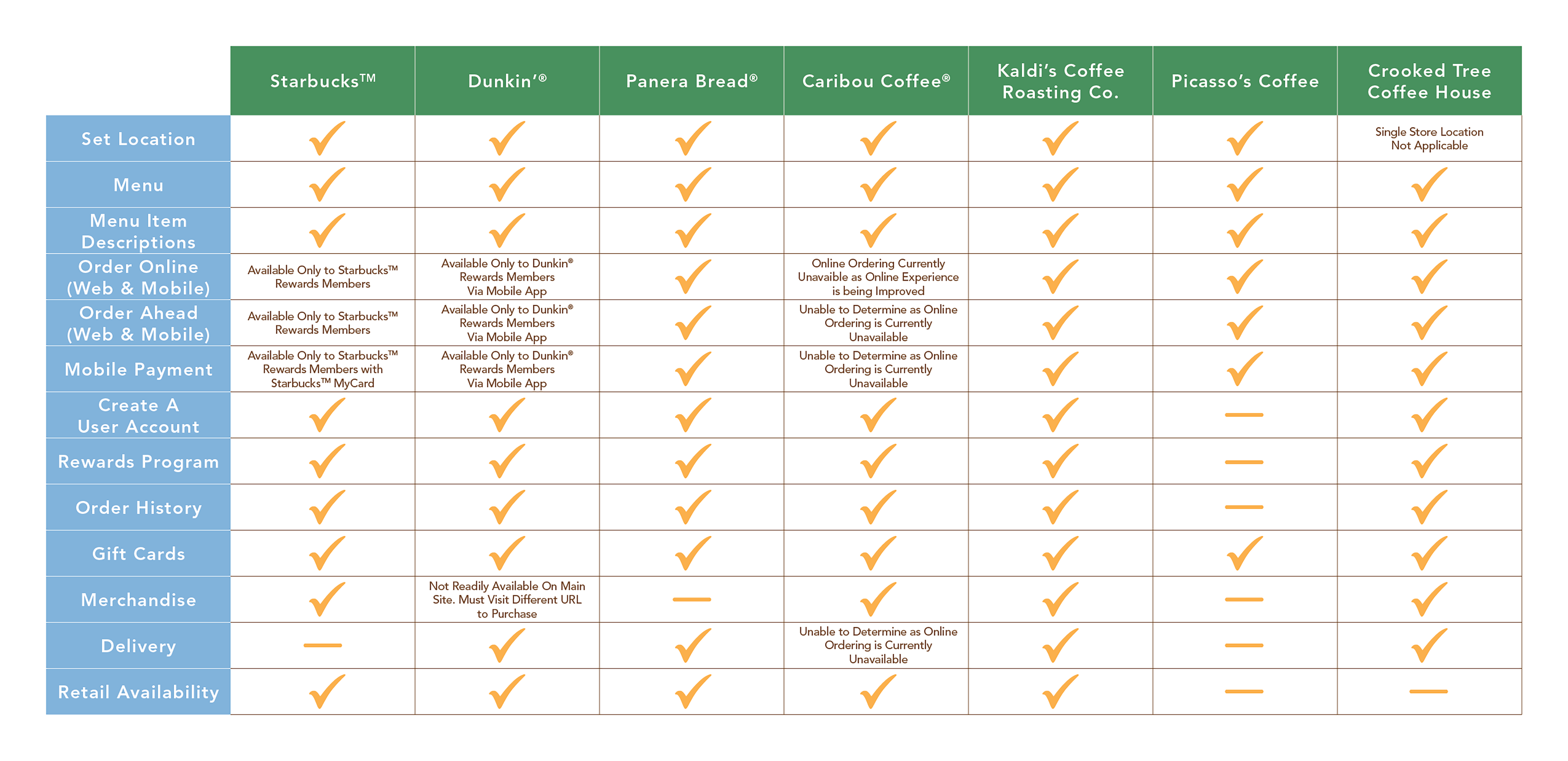
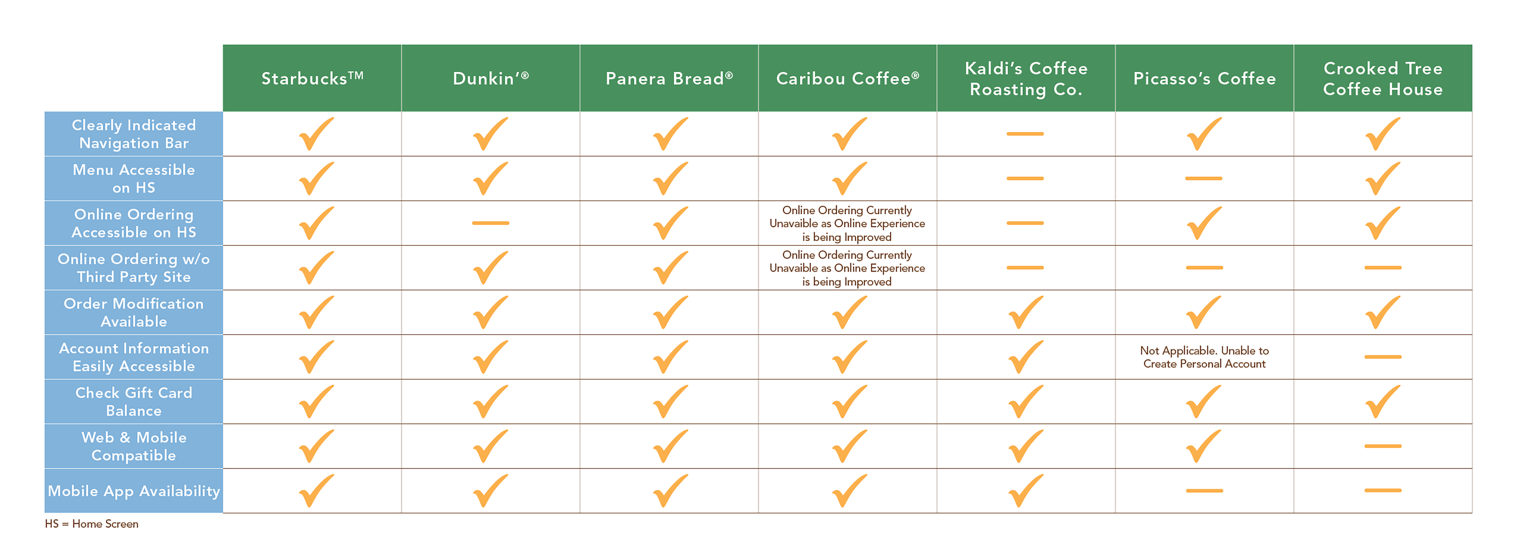
Although the aesthetics of the current site were poor, it did include standard navigation tools. However, these elements required refinement, as they were not clearly defined and lacked intuitive functionality. Key features such as account information and menus were buried within the site structure, making them difficult for users to locate quickly. Other actions, such as payment, redirected users to a third-party platform, pulling them away from the main site and disrupting the overall experience.
CConsumers were seeking a convenient experience that would help them make better use of their time within busy schedules. Many also expressed a desire to support a local business rather than a large corporate chain. While the café already delivers strong customer service and personal care in person, the website did not reflect that same level of thoughtfulness and was not user-friendly, highlighting the need for a refreshed and more intuitive digital experience.
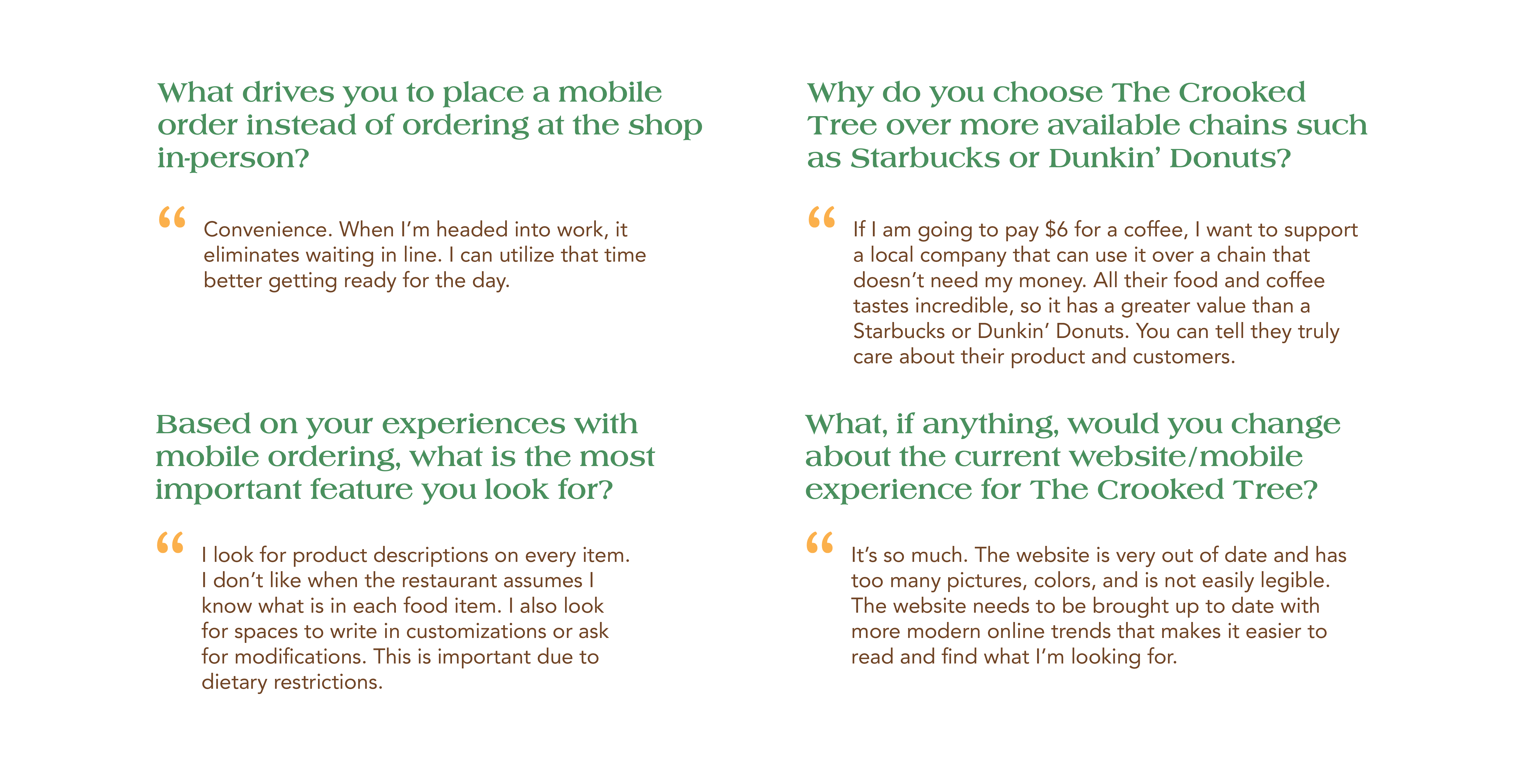
Consumers needed a fast, intuitive way to order high-quality products while retaining the flexibility to customize their orders for personal preferences or dietary restrictions. At the same time, users who value social experiences wanted to easily share their favorite café with friends, colleagues, or community members—whether coordinating an in-store meetup or sending coffee to the office—making the digital experience an extension of the café’s welcoming, community-focused atmosphere.
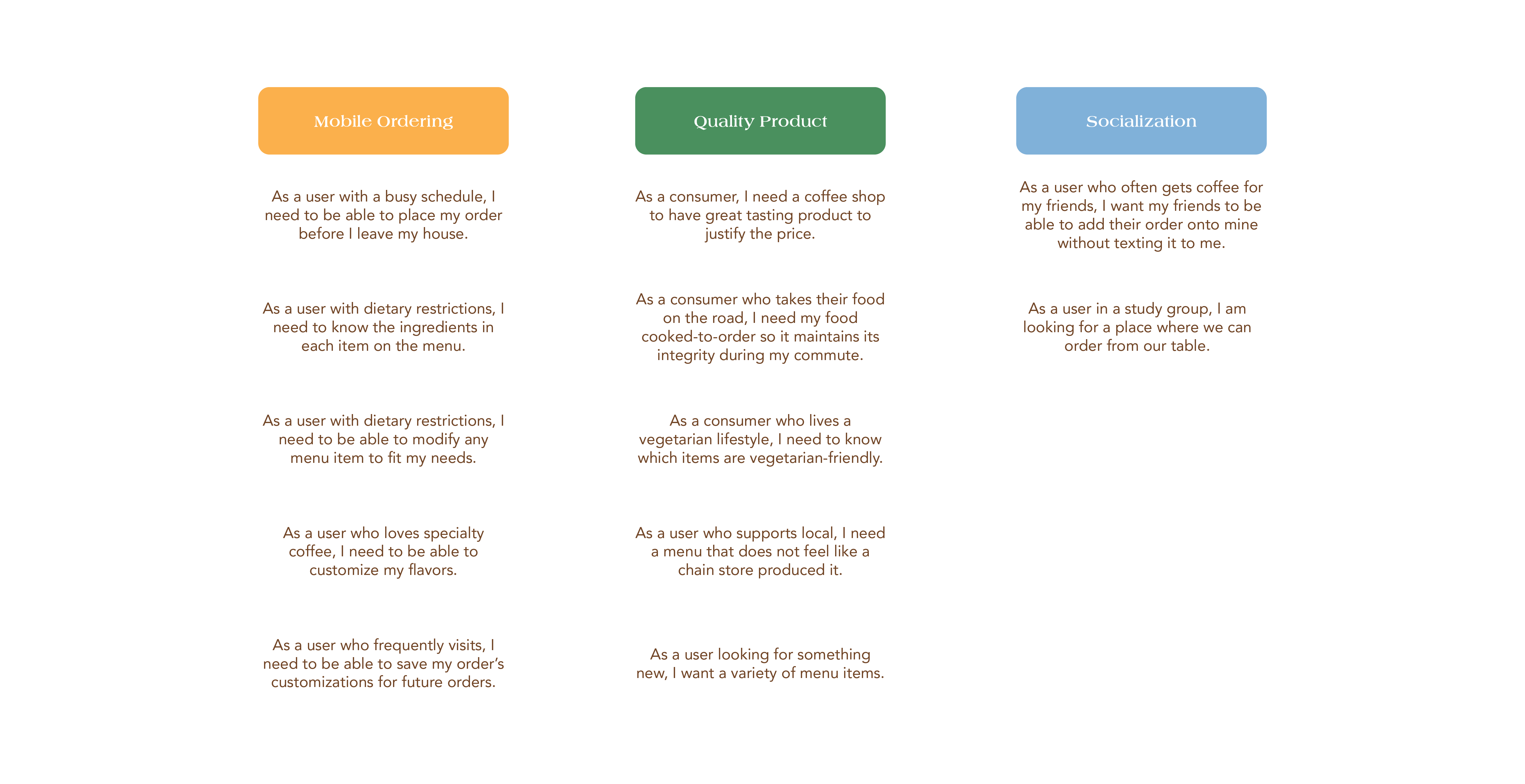
Because The Crooked Tree Coffee House attracts a diverse range of users, the app was designed with multiple user flows to accommodate guests, first-time visitors, and returning customers. Each flow was carefully adapted to ensure that every user could navigate the app efficiently, enabling orders to be placed quickly and easily while minimizing friction at key touchpoints. This approach prioritized speed, clarity, and accessibility, ensuring a seamless experience for all types of customers.
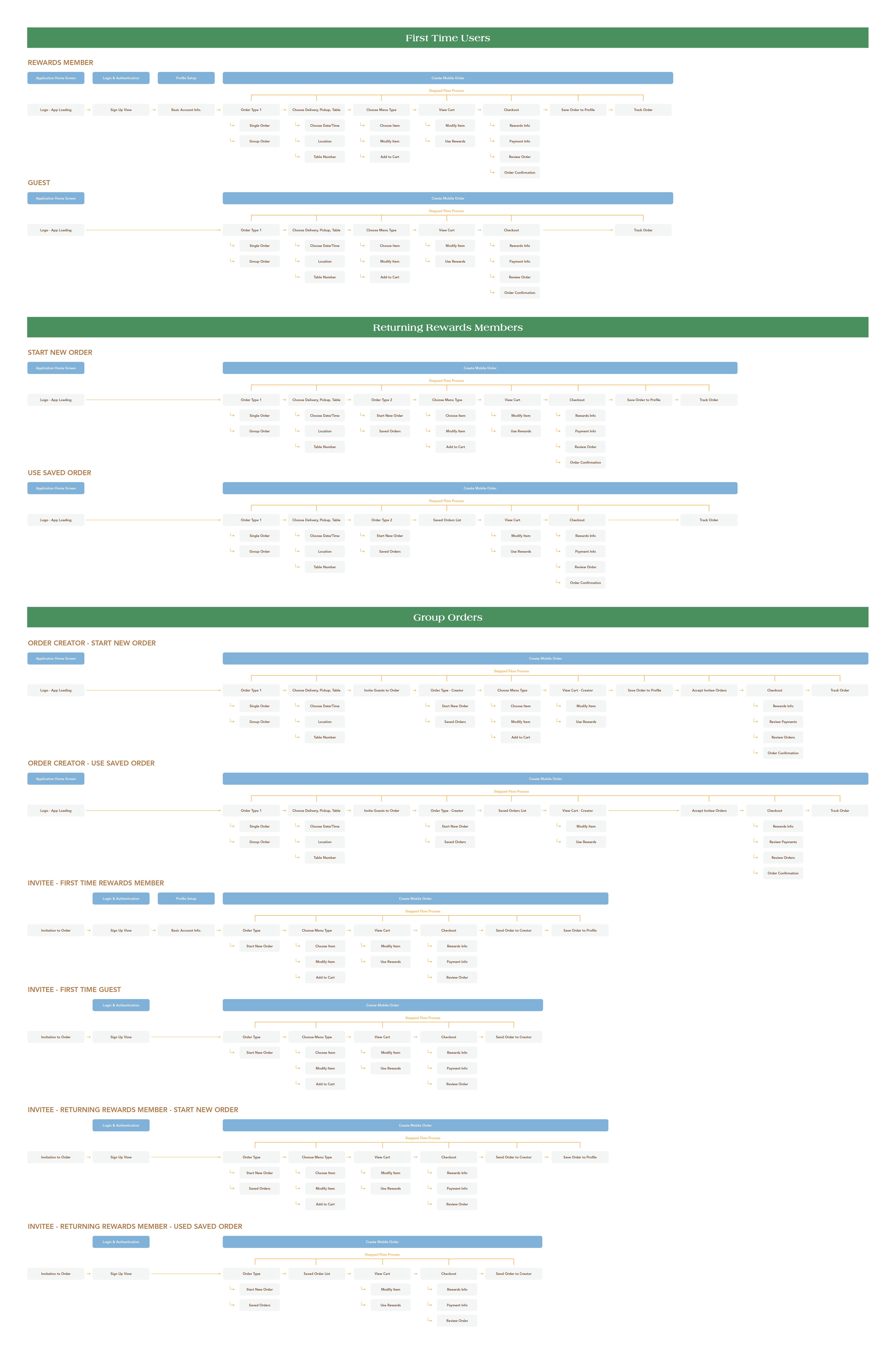
Based on the established navigation workflows, an initial system of wireframe components was created to ensure visual consistency across the platform. While this provided a strong foundation, the layouts were refined during the design process to better accommodate user behavior, improve hierarchy, and enhance overall usability, ensuring the interface remained both cohesive and intuitive throughout the app.
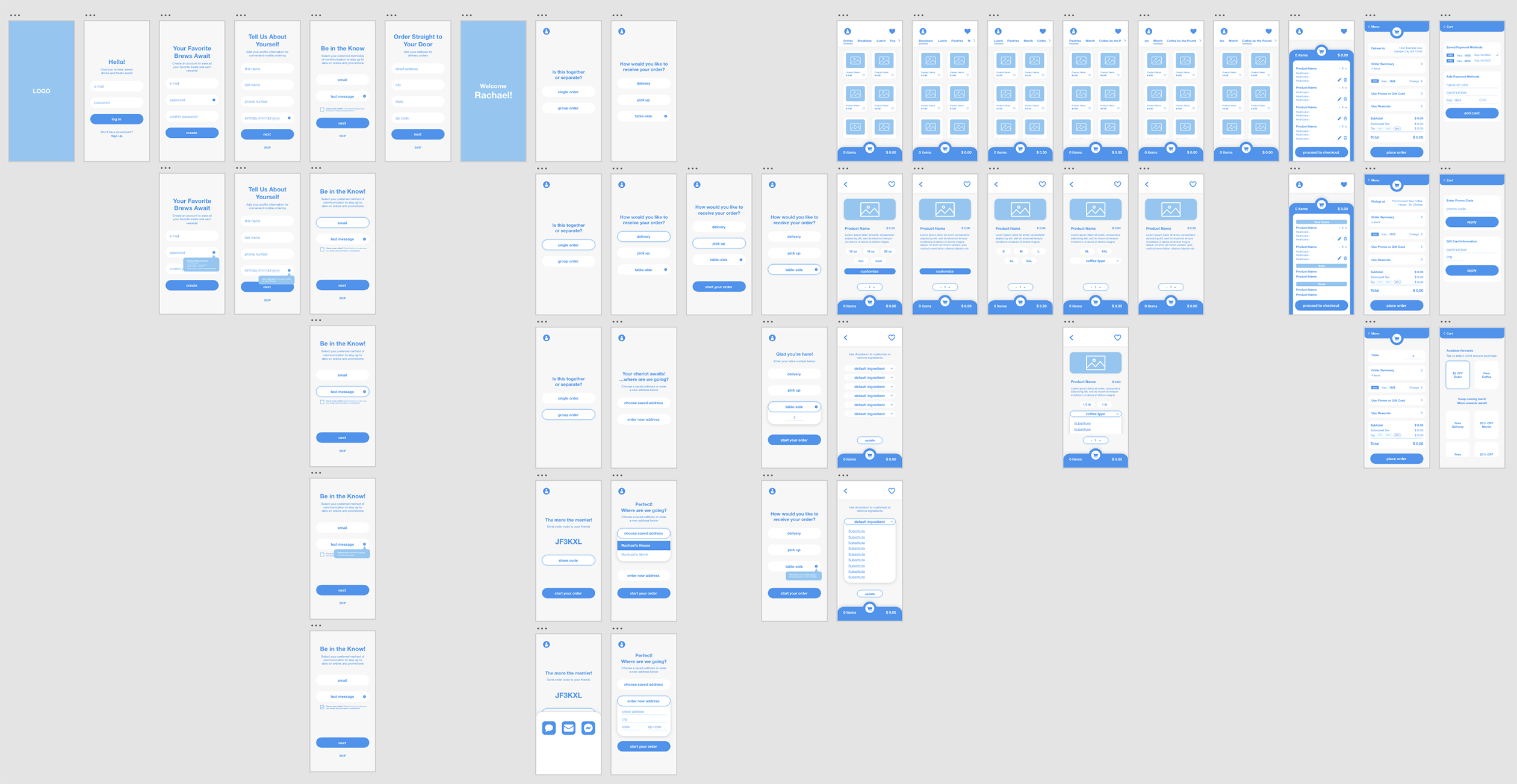
Research into other food apps and digital platforms informed the development of the final aesthetic. By analyzing what worked—and what didn’t—in these references, a foundation for the design exploration was established. Common patterns, such as limited color palettes and simplified, cohesive color schemes, were implemented to create a clean, approachable, and visually consistent interface that prioritized usability and clarity for the user.
Concepts shown above are the intellectual property of Rachael Hollis. All work is displayed for portfolio purposes only.