The Crooked Tree Coffee House is a local coffee shop located in Missouri. They have been providing their small college town and the community that surrounds it with delicious coffee, teas, breakfast, lunch, pastries, and more since 2002.
This coffee shop needed a refresh to their online presence that truly represented the quality of this family-owned business. The Crooked Tree Coffee House cares for each customer with personal connection and ensures they provide each customer with not just the perfect cup of coffee, but the space to come relax and escape the hustle and bustle of daily life.
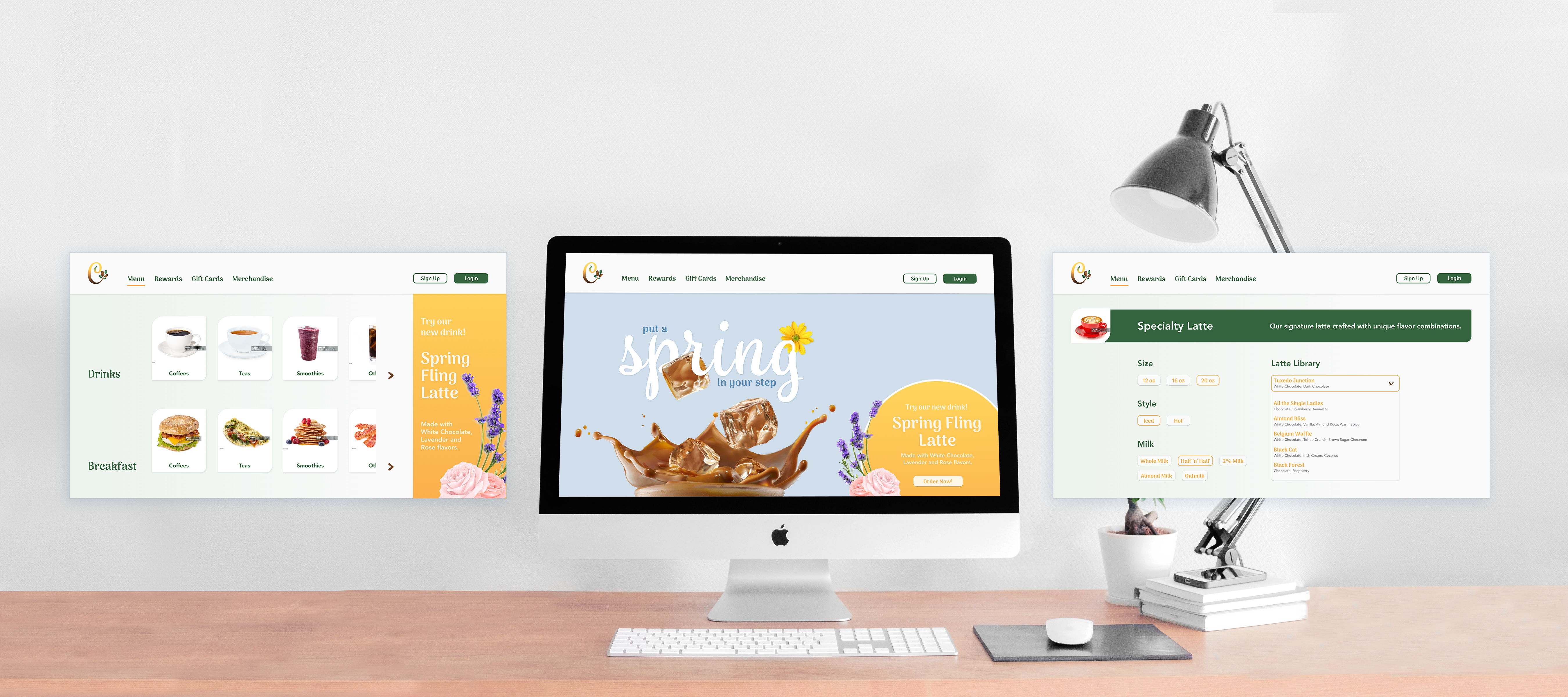
Develop a mobile app and desktop website prototype that reflects the uniqueness and personality of The Crooked Tree Coffee House reflecting the company's new brand refresh.
See Brand Refresh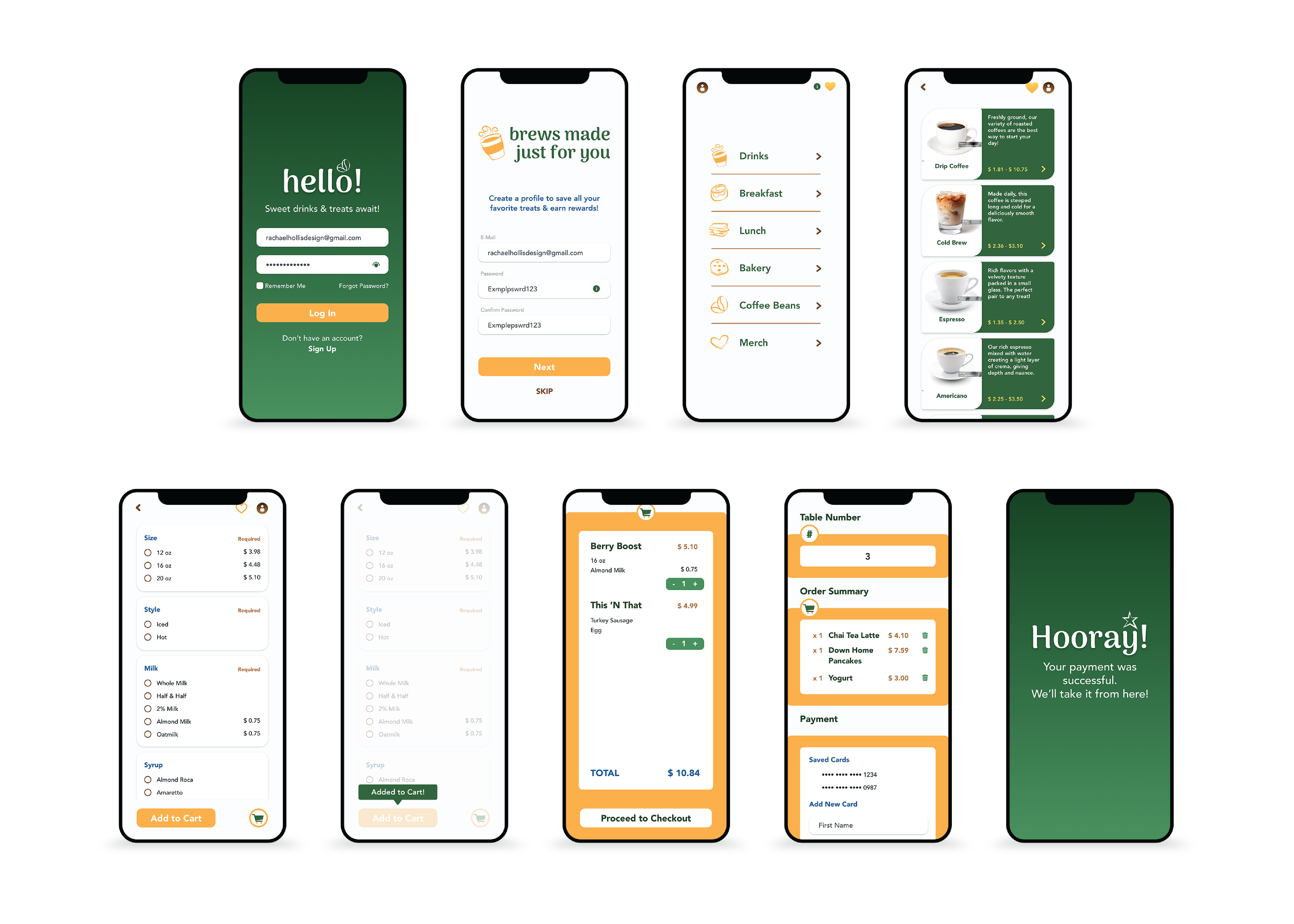
The consumer is looking for a quick and easy experience to order their morning cup of coffee or afternoon pick-me-up. Whether they are on their way to work or looking for a place to gather with freinds, they are looking for something new and special that provides a service that a drive through chain location may not be able to provide.
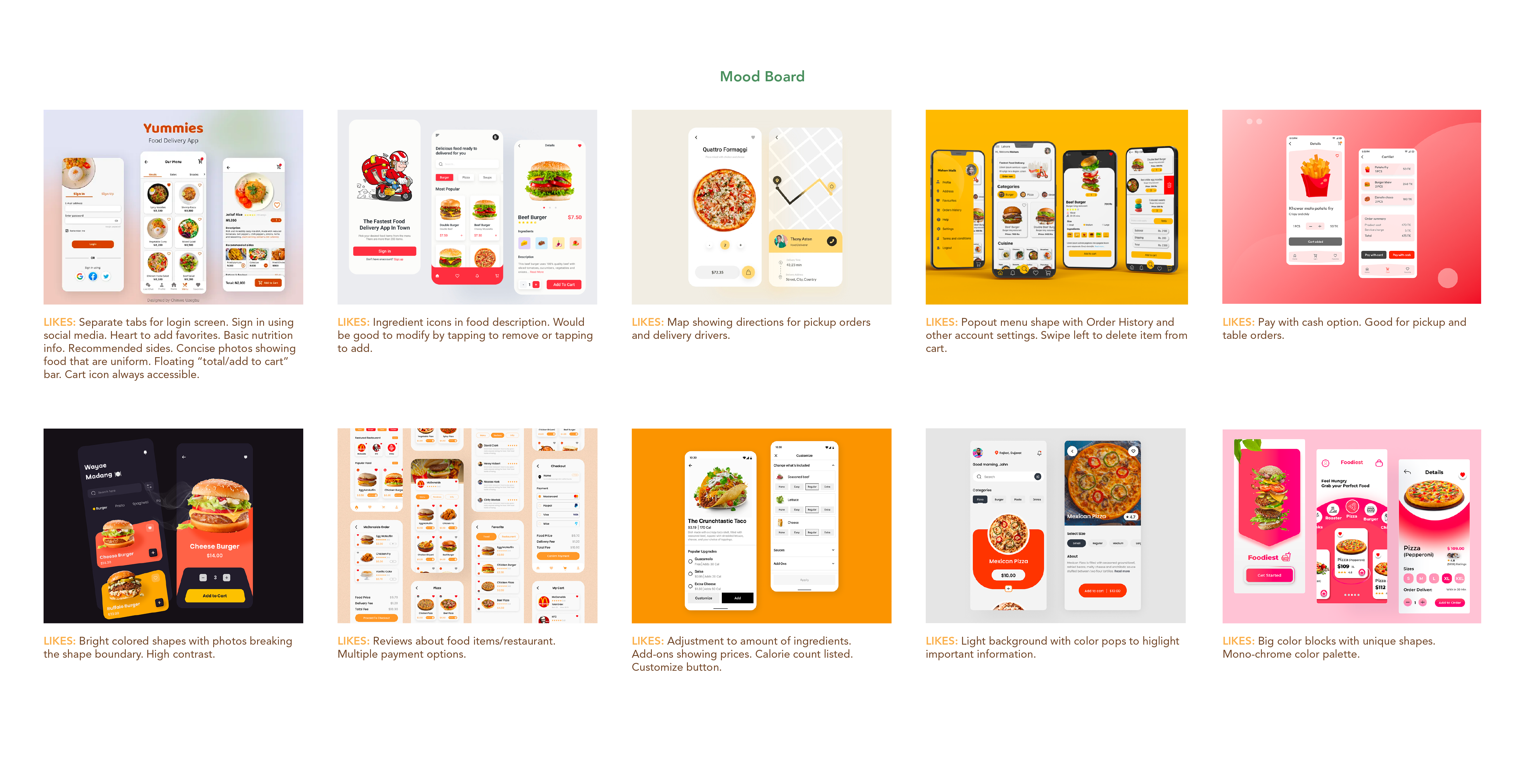
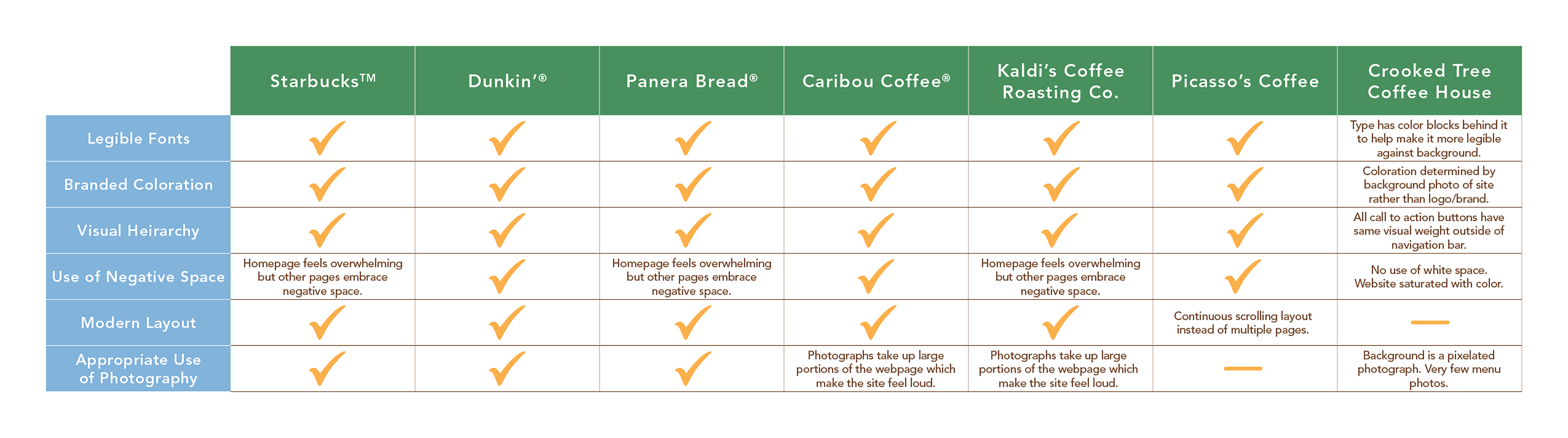
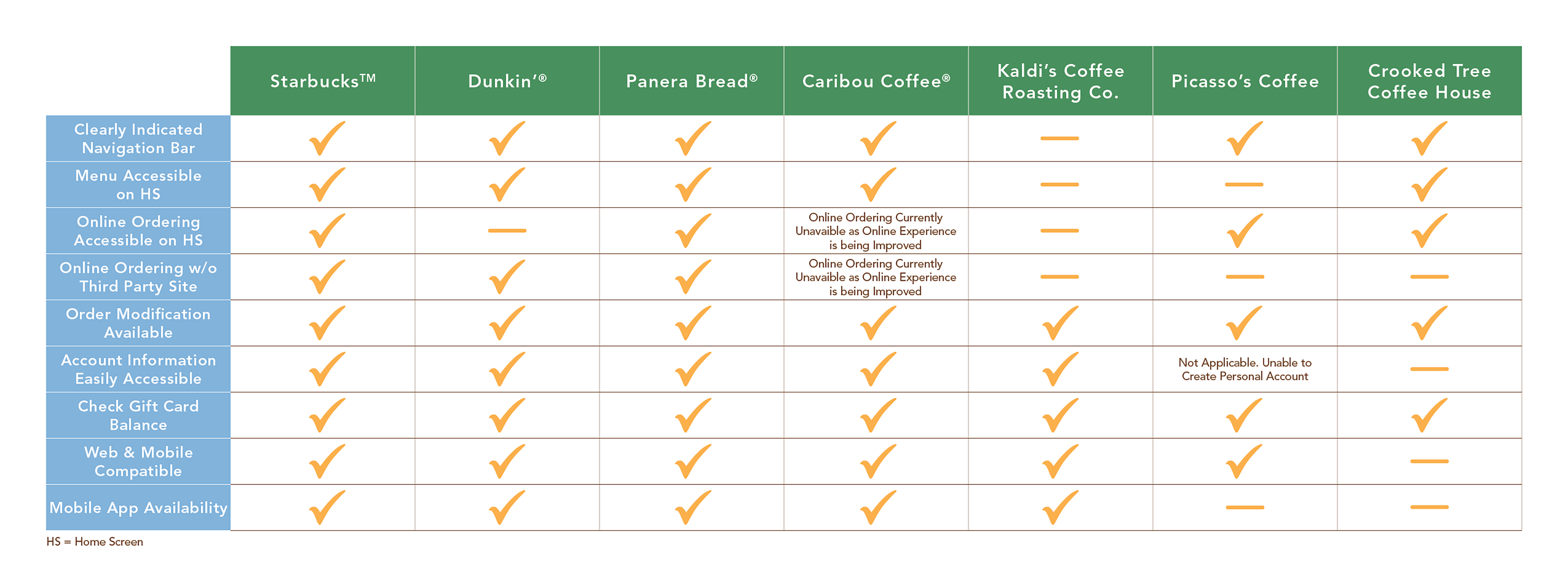
Competitor's websites and mobile apps emphasize legibility and consistent branding with clear visual heirarchy that drives the consumer through the experience. They enhance legibility through their use of negative space and more modern layouts. Their current site was overrun with imagery and had low contrast.
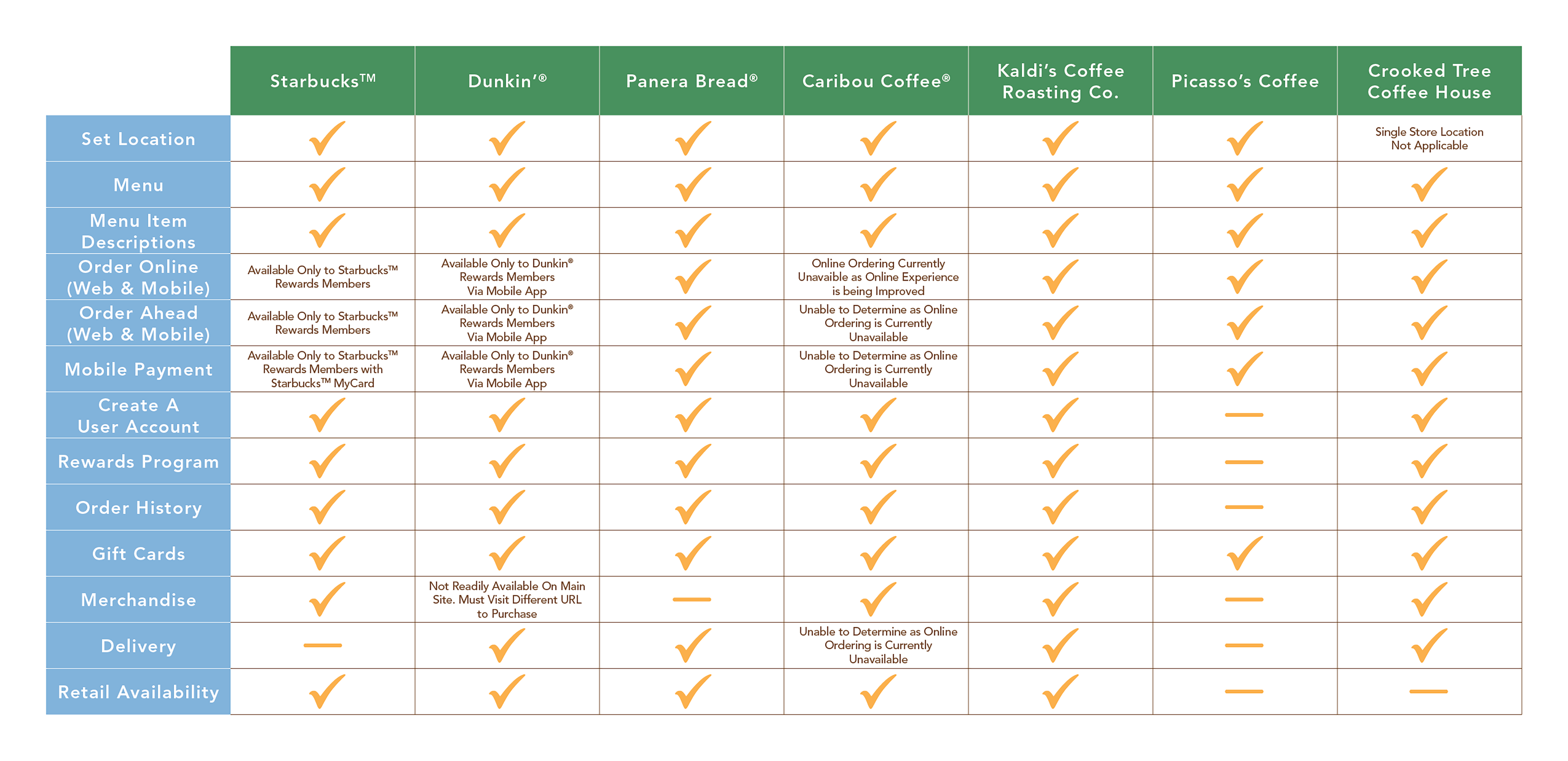
Compared to competitor's, The Crooked Tree Coffee House offered more features to their consumers. While major retailers offered exclusive features only available to rewards members, The Crooked Tree Coffee House allowed access to all features regardless of rewards memeber status.
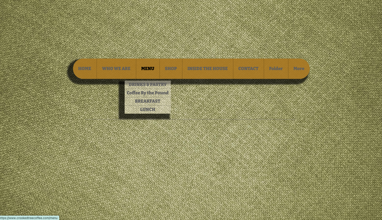
Although the aestheics of the current site are poor, the site did provide standard tools for navigation. However, the tools themselves needed rework as they were not clearly defined and were not intuitive to use. Some features such as account information and menus were buried in the site, and not easy to locate immediately. Other features, like payment, required a third party site, navigating you away from the main page.
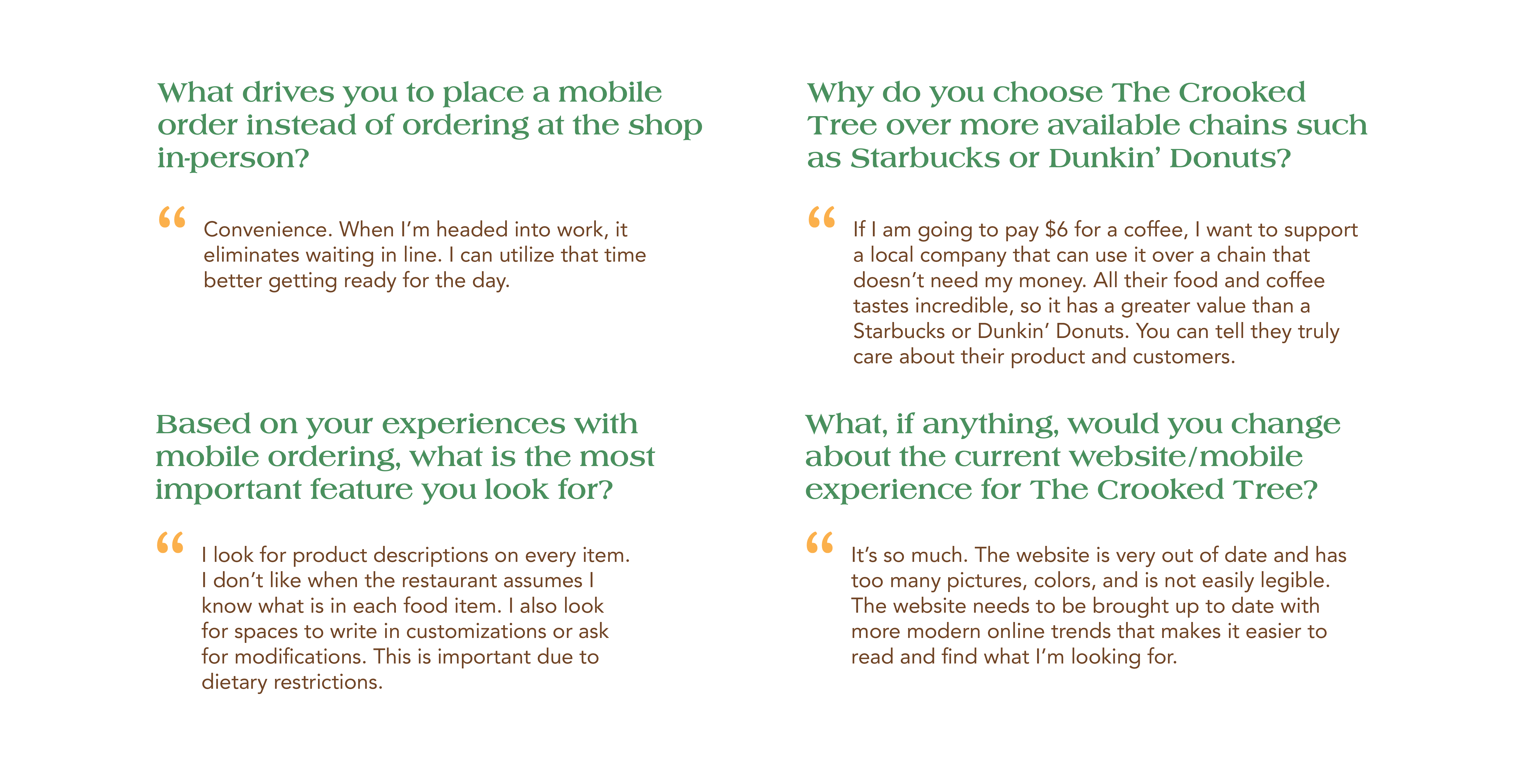
Consumers were looking for a convenient experice that would allow them to utilize their time more effectively in their busy schedules. They wanted to use their money support a local business instead of a major corporation. While the business provides excellent customer service and care, their website was not user friendly and needed to be updated.
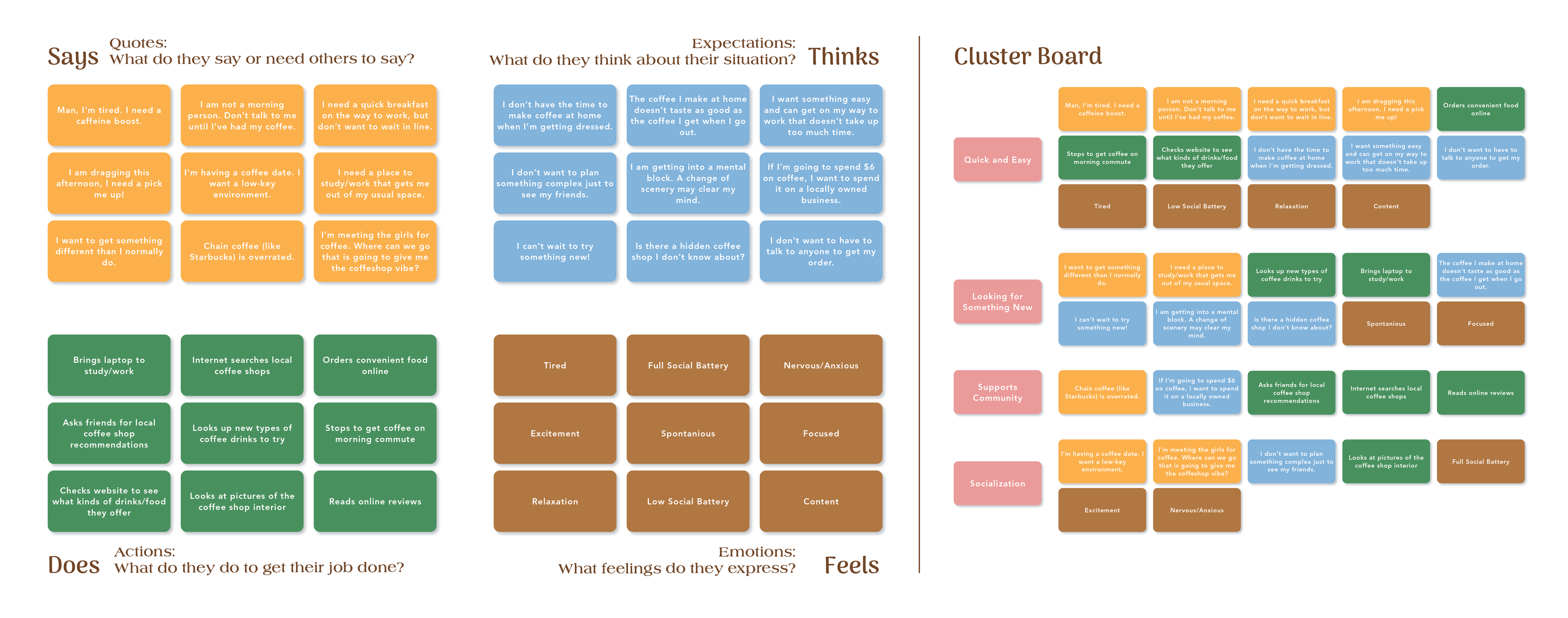
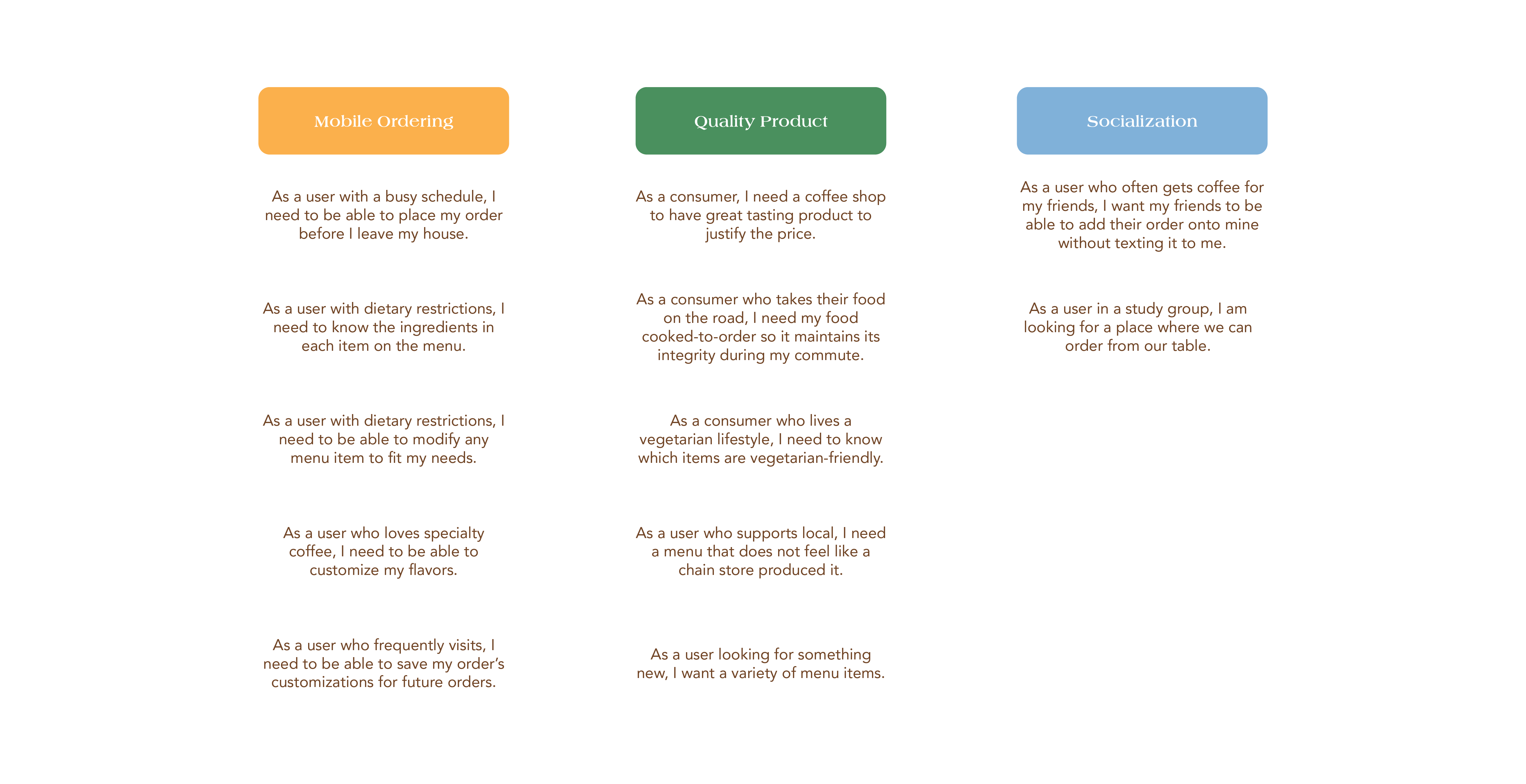
Consumer's needed a quick and easy way to order quality product that would allow them to modify their orders based on prefereces or dietary restrictions. Users who enjoy social environments wanted to share their favorite shop with members in their community, whether it be an in-store meet up or an office coffee run.
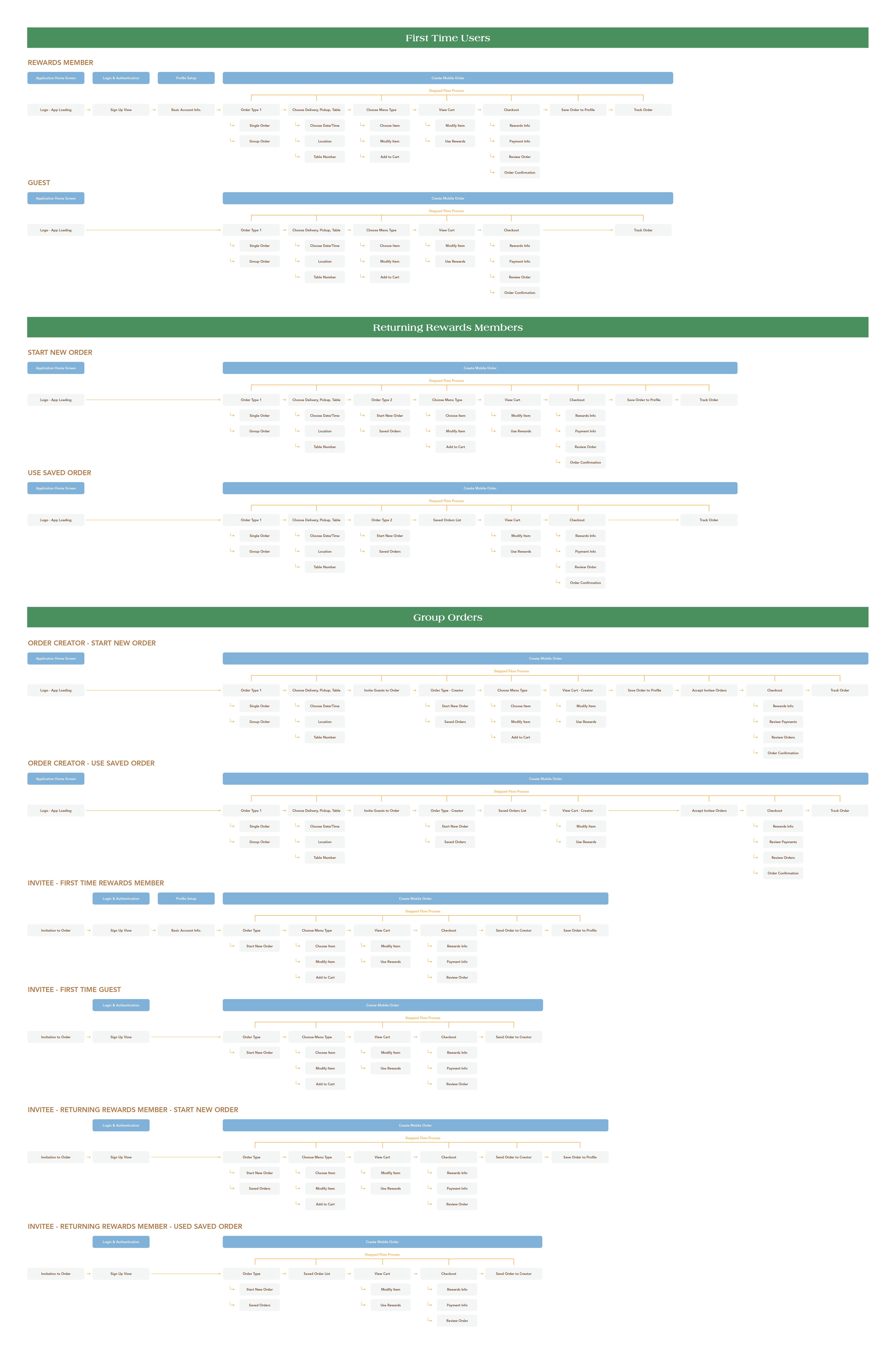
As The Crooked Tree Coffee House would attract a variety of users, flows were developed that allowed for guests, first time users, and returning users to navigate the app effecively. This would involve many adaptations to ensure the consumer could make their orders as quickly as possible.
Based on navigation workflows, an initial system of wireframe components were created to keep aesthetics consistent across the platform. While this was a good starting point, as design was underway, certain layouts were adjusted.
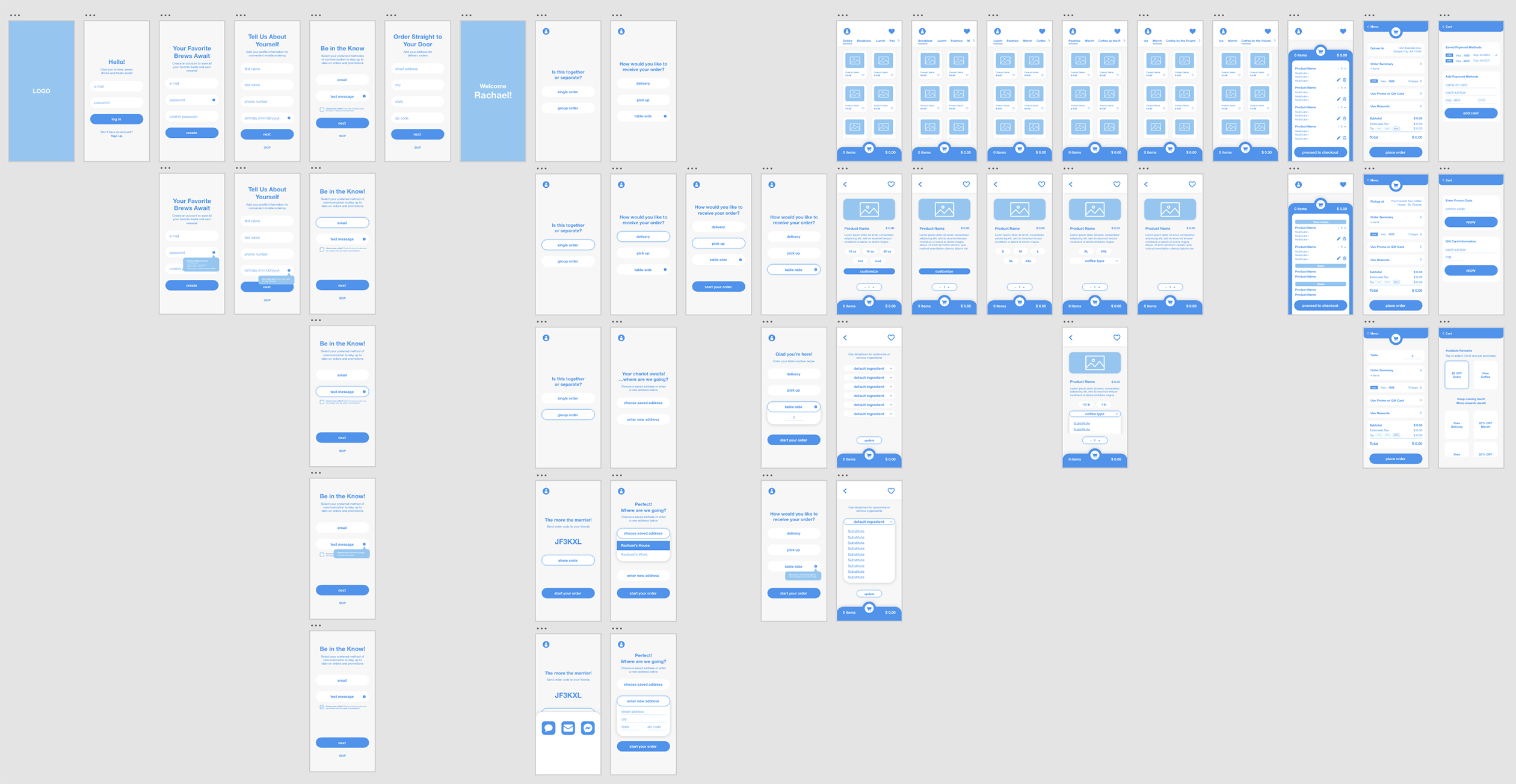
Research of other food apps and designs contributed to creating the final aesthetic. Determining what was successful and not successful in our references was the foundation of the exploration. Limited color palettes with simpified color schemes were common themes that were implementd in this design.